|
GeoGebra, the mathematical explorer
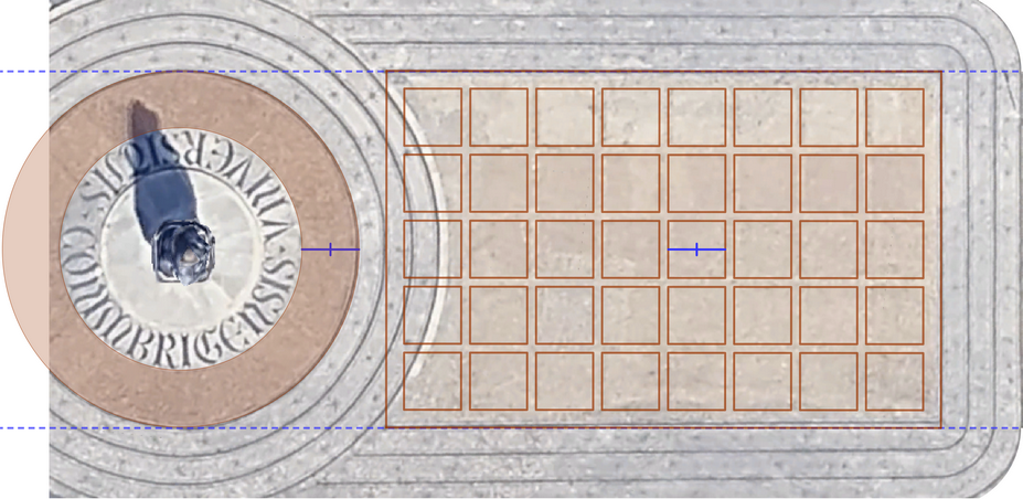
Zenithal view of the Statue of Dom Dinis, with the inscription UNIVERSITATIS COIMBRIGENSIS
rafael.losada@gmail.com
II International GeoGebra Congress University of Coimbra October 23-25, 2025
Human Trace
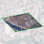
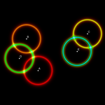
The header of this page is a
top-down view of the statue of Dom Dinis, located right in front of this
Department of Mathematics of the University of Coimbra. Since GeoGebra allows
inserting images as the background of the graphics view, we can highlight the
elements we want and make annotations about them. Images like this are very easy
to obtain and make it possible to pose a wide range of questions depending on
the desired level, from "How many squares appear?" or "Can you calculate how
many there are without counting them one by one?" to "Taking the area of each
square as the unit, what is the area of the colored circular ring?" or "What is
the area of the visible part of the rectangle (notice that the circles
surrounding the statue overlap part of it)?". GeoGebra’s tools help students
explore, calculate, and verify their conjectures.
Google Maps @40.2036376,-8.5959846,1252m
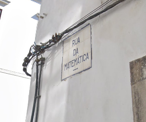
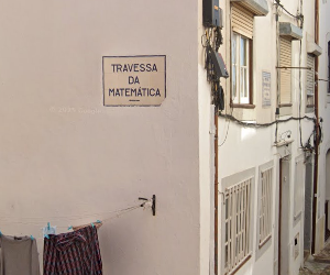
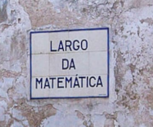
We are at the University of Coimbra (UC), a World Heritage Site since 2013. The names of some streets reflect the deep influence of the University on this "city of the students". Less than 400 meters from here, we can walk along Rua da Matemática (Mathematics Street), Travessa da Matemática (Mathematics Alley), and Largo da Matemática (Mathematics Square).
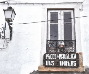
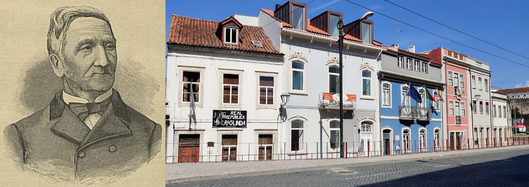
For over a century, university students have founded numerous Repúblicas (student communities, around 10 or 20 people, who share housing, meals, expenses, excursions, parties, and even a flag). In the images, you can see three of these student Repúblicas, located at numbers 2, 6, and 40 on Rua da Matemática (named after André do Avelar, who lived there).
Other historical mathematicians from the UC were Pedro Nunes, José Anastácio da Cunha, Miguel Franzini, Florêncio Mago Barreto Feio and Rodrigo Ribeiro de Sousa Pinto, which gives its name to the neighborhood that is right next to the Escadas Monumentais that descend from where we are:
This year's International Mathematics Day (Pi Day, March 14) 2025 was dedicated to the shared creativity found in both Art and Mathematics. It is no surprise, then, that throughout history, art has often turned to mathematics in its search for construction methods to represent reality, such as the study of perspective, or to express beauty, through properties like proportionality and symmetry.
It is not hard to find examples of this relationship around us. Less than 400 meters from where we are stands the cloister of the Old Cathedral (Sé Velha, 13th century), where we can admire its 20 rose windows, all different from one another (photos by Mariló Fernández Mira, 2007). Each of the four sides of the cloister has five pointed arches, and each of these spans a rose window and two semicircular arches. At the corners, the pointed arches intersect at the height of the semicircular arches, producing a curious effect.
I have repositioned the rose windows against the same two background arches to highlight their differences and symmetries (omitting slight flaw, which, curiously or deliberately, although it break rotational symmetry, preserve dihedral symmetry). These rose windows have simple designs and could be proposed as GeoGebra reconstruction activities for secondary education. The 20 dihedral rose windows have symmetry orders of 3, 4, 5, 6, and 8, all constructible polygons, while 7 is not (Ortega, Ortega, Ortega, and Crespo, 2005). The same cloister can also be used to propose the construction of pointed and semicircular arches (Arranz, Losada, Mora, and Sada, 2008 and 2009).
Surely the first idea you think of for using the activated trace is to draw, to turn it into a pencil. For example, using trace with color greatly facilitates the creation and visualization of any kind of rosette, whether cyclic or dihedral (Losada, 2010).
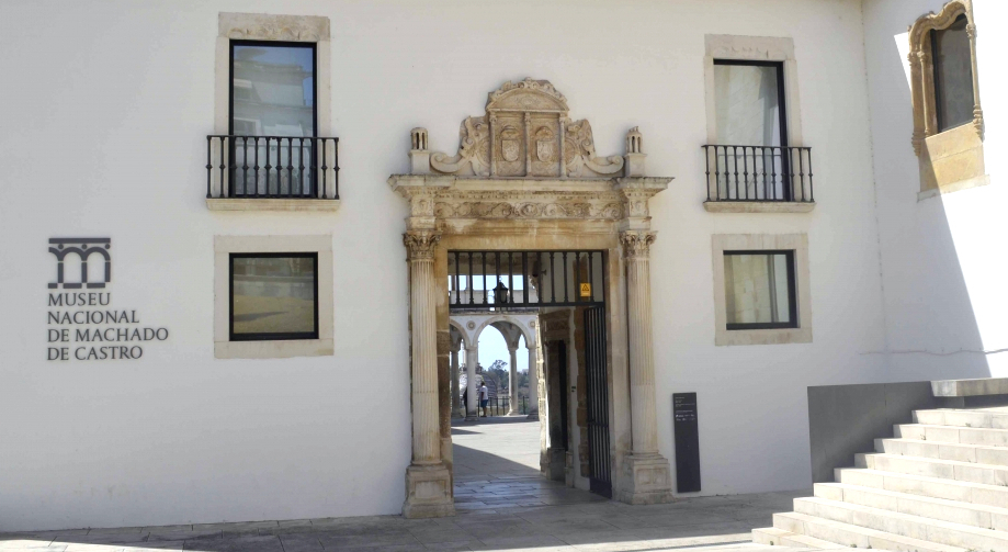
Let's now enter the Machado de Castro National Museum, located less than 300 meters from here.
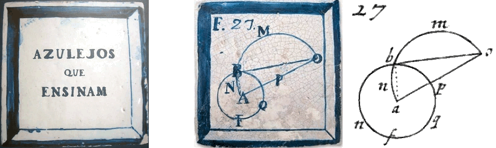
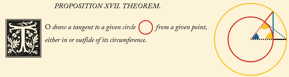
Inside, fourteen 18th-century mathematical tiles are preserved, originally used to decorate some classrooms of the former Jesuit college. As discovered in the 1990s by António Leal Duarte (from the Department of Mathematics where we are now), these tiles reproduce several figures from a edition of Euclid's Elements (Tacquet, 1683), as shown on the right side of this image (Requena, 2014).
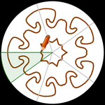
This particular figure corresponds to Proposition XVII from Book III, which gives and proves the steps to draw a tangent to a circle from a point on it or on its exterior.
Before presenting
more examples of using the trace feature, let's recall that GeoGebra
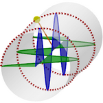
makes it very easy to perform circle inversions. Here we see how we can easily create, by 2D inversion, a Steiner chain, checking that the inversion maintains the tangencies, but the centers of the circles no longer form a circumference but an ellipse (in green).
When extended to 3D, the envelope of the spheres being inverted (in the turquoise blue sphere) forms a torus. The inversion of this torus in that same sphere, that is, the envelope of the corresponding inverted spheres, forms a Dupin cyclide (in the case of 6 spheres, the cyclide envelops Soddy's hexlet). With infinite spheres, we obtain the Pappus chain, where the Dupin cyclide corresponds to the inversion of a cylinder.
The most common geometric tiles are not mathematical tiles of the kind we saw earlier, but rather those designed to repeat a pattern through periodic tessellation. While the Islamic influence on this kind of art is stronger in Spain than in Portugal, where tiles tend to be more figurative than geometric, examples do exist.
We can find geometric tiles in the Old Cathedral of Coimbra, but I chose this tile from the Sintra National Palace because of its simple design and the complementary nature of the two predominant colors, which increases the contrast effect. This complementarity translates into numerical complementarity in the RGB channels (the additive mixing of both colors results in white).
If we take a photo of the tile (or any rectangular
region capable of tessellating by translation) and place it as a
filling image of any flat
shape, such as a circle, moving the shape will move the image across the
tessellation. So, simply activate the trace to reproduce it. However, this
tactic, while very attractive, only works for rectangular tiles,
is not very effective for quickly changing colors
and also does not allow us to invert the tile, as we will do. The construction allows not only the translation of the tile across the plane (using the Ulam spiral), with these or other colors, but also its inversion. To achieve this without overloading GeoGebra with too many objects, only one tile is moved at each step (inverted or not), so the appearing tiles are not new objects, but rather the trace left behind by a single tile (Losada, 2025). We can also view the mosaic in perspective, using the 3D view.
We will now focus
on regular tessellations. In Euclidean geometry, there are only three: the
triangular, the square, and the hexagonal. Using the notation {p, q},
where p is the number of sides of the regular polygon and q
is the number of polygons surrounding each vertex, these tessellations
are expressed as {3, 6}, {4, 4}, and {6, 3}.
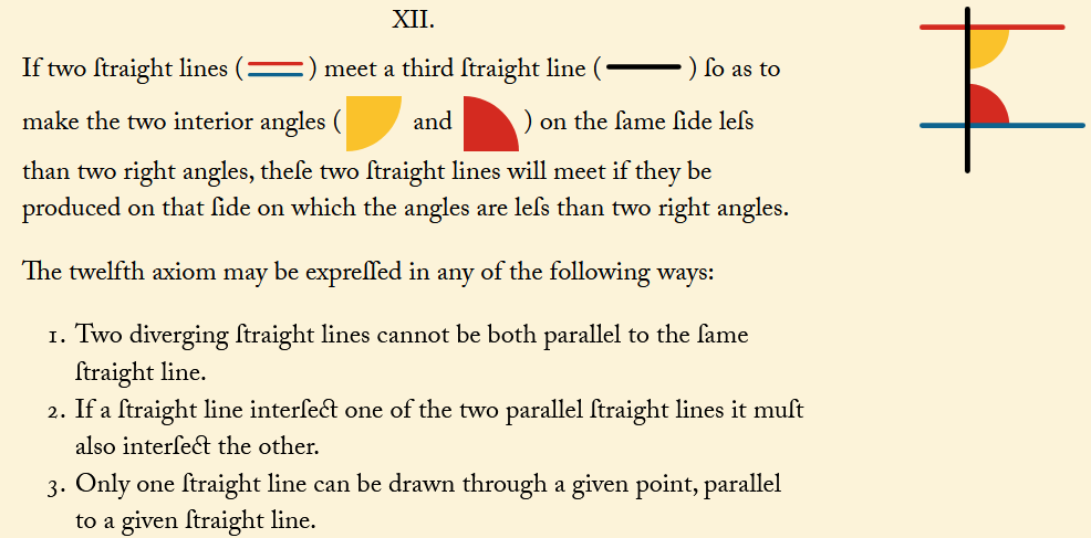
Book I. The 5th postulate of Euclid's Elements (reordered in Oliver Byrne's edition as Axiom XII)
We can distinguish Euclidean geometry from those that do not satisfy Euclid’s fifth postulate, elliptic and hyperbolic, using {p, q} configurations, that is, regular polygons with p sides where q meet at each vertex. In particular, the value of the expression (p – 2)(q – 2) differentiates each geometry. When it equals 4, we have three possible cases (the usual regular tessellations). When it is less than 4, we obtain the five regular partitions of the sphere, origin of the five Platonic solids.
Note: in this classification we assume that the polygons of the regular tessellation have at least 3 sides. In elliptic geometry, tessellations with 2-sided polygons (or even just 1!) can occur.
Straight lines in Euclidean geometry become great circles on the sphere (since two of these circles always intersect, there are no parallels, and thus the parallel postulate does not hold).
To obtain the five partitions of the sphere, we transform the edges of the polyhedra into arcs of great circles. Using this same procedure, we can transform any planar tiling (Euclidean geometry) into a spherical one (elliptic geometry). If you have a 3D printer, these mosaics can be used as personalized lamps 🙂.
To color each spherical polygon we use the functions arg() and alt(), with which a (planar) polygon can be easily transformed into a spherical surface, whose constantly changing color pattern can cover the entire sphere. However, creating each spherical polygon requires a lot of resources, so for our tiling we chose to create small arcs of circles, with the trace activated, instead of surfaces (Losada, 2025).
What happens when (p – 2)(q – 2) is greater than 4? With GeoGebra, we can find out. Just as in elliptic geometry the size of each regular polygon is determined by the sphere, now it will be determined by the unit circle (let us remember that in Euclidean geometry the polygon is scalable, it can have any size).
In the Poincaré disk, straight lines in Euclidean geometry become arcs of circles orthogonal to the unit circle (so through a point outside one of them, more than one can be drawn that does not intersect it, and thus the parallel postulate does not hold).
The construction does not use any hyperbolic geometry tool; it only repeatedly applies the inversion command in certain circles. As before, thanks to the trace left by each cell, we only need to update one cell (by reflecting it into the next), so GeoGebra retains its full computational and execution capabilities at all times. To do this, it is enough to adapt to hyperbolic geometry the Ulam spiral used in the Euclidean construction, obtaining Poincaré disks (Losada, 2025) ideal as coasters 🙂.
Thus, we can observe the Steiner chains that are generated, create our own tessellation with any tile we choose, generate the disk with the triangle group that Coxeter sent to his friend Escher, Escher’s reply in the form of the engraving Circle Limit I, self-duality, and, in general, generate any regular hyperbolic tessellation {p, q}. The chromatic number (cn) does not depend on the geometry (since the dual graph is a topological concept) but only on the values {p, q}. When q is even, cn = 2. When q = 3 and p is odd, a wheel with an even number of vertices (Wp+1) is formed, so cn = 4. In all other cases, cn = 3.
Surely, these are the first 'complete' tessellations in the Poincaré disk made with GeoGebra and, most probably, this is the first hyperbolic mosaic made with a tile with Mudéjar influences found in Portugal 🙂. Now, to perform any other similar procedure, simply change the content of the lists that define the central tile, and their subsequent reflections will be performed automatically.
Constructing the fundamental tile is often a highly instructive activity. In this example, we show how to create a tile that tessellates the plane through translation, starting from a tetrahedron. We cut the tetrahedron along a Hamiltonian path, that is, passing scissors or a cutter through all four vertices in a single stroke.
Then, we unfold the tetrahedron. It has been proven that the resulting shape always tessellates the plane (Akiyama & Matsunaga, 2015).
We can use empty lists as data stores. In this case, we'll use the list
"reg"
to store the positions of a moving point, replacing its trace with the
polygonal line that connects all of those positions. Each time point P
changes position, the command SetValue(reg, Append(P, reg)) is executed. The advantage of this method is twofold: it improves the visualization of the path taken and allows us to estimate its length.
We can assign a script to an animated slider so that each
time its value is updated, it executes the GeoGebra instructions contained in
it. This procedure, together with the trace being enabled, allows us to
visualize the path of the points that follow those instructions.
The orange point represents the Sun, the blue one the Earth, and the white one
Venus. Every 8 years, Venus completes almost exactly 13 revolutions around the
Sun. During that time, Venus overtakes Earth 5 times, generating an
envelope
resembling 5 interlaced cardioids (it would be a single
cardioid if Earth's year
lasted exactly twice as long as Venus's).
Assuming perfectly circular orbits and an exact 13/8 ratio, the Flower of Venus
would be a perfect
epitrochoid, i.e., generated by a large wheel rolling (without
slipping) around a circle centered on Earth with radius 5/13 of the Earth–Sun
distance.
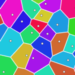
GeoGebra allows us to create a Voronoi diagram. Although it only draws the diagram itself, the regions can be colored later using the graph information. In this construction, you can observe the various regions, the Delaunay triangulation, and the convex hull of up to 50 sites.
However, in some cases the Voronoi command produces errors. Moreover, it assumes we are using the Euclidean (L2) distance. Thanks to color trace, we can verify the correct diagram and also create new ones using other distance metrics. In this example, we use the taxicab distance (L1) and the chessboard distance (L∞), both of which produce square-shaped circles. Here's the procedure:
1. Create a slider r from 0 to d, where d is large enough (e.g., the maximum distance between the sites). 2. Create circles centered at each site with radius r. Assign a different color to each and activate their trace. 3. Animate the slider r so that it decreases from d to 0.
Until the 18th century, mathematics was not prepared to tackle the intriguing
problem of determining the motion of a stretched string when plucked — a problem
that would give rise to what is now known as
Harmonic Analysis.
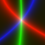
Dynamic Color Trace
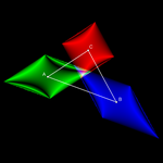
Hyperbolas cutting the sides of a triangle into proportional parts (see Appendix II)
We can take advantage of the combination of the Trace and Dynamic Color properties to create a powerful and versatile tool for exploring the relationships, possibly hidden, between mathematical objects.
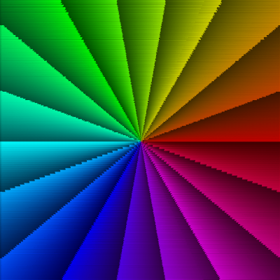
We are accustomed to seeing and interpreting heat maps such as those that represent variations in elevation in topography or pressure and temperature in meteorology. In this section, we'll see how to create a mathematical heat map with GeoGebra and explore some of its applications.
Let's place a free point with the trace activated and define its dynamic color as a function of a condition c that we want to visualize. Since each RGB channel requires a value between 0 and 1, we do not assign c directly to each channel. Instead, we input a function h such that h(c) ∈ [0,1].
For example, the function h might be h(c) = |cos(𝜋/2 c)|, or h(c) = 1/(1+|c|). If we want to emphasize values closer to 1, we can add a coefficient k greater than 1: h(c) = 1/(1+k|c|).
Note: Of course, in this last case (which we will use most often), the base e can be replaced by another base like 2, 3, or 10. In any case, only when c is 0 will the channel value be 1, and it will get closer to 1 as the absolute value of c decreases. Here we will use the exponential function h(c) = e-|c|.
We can replace the traced point with a small square. This is convenient when we want to preserve the visibility of the coordinate axes or a background image, since a point doesn't allow you to control its opacity, but a polygon does.
Inspired by António, in response I created the first dynamic color scanner, consisting of a single point that systematically scanned the entire screen (Losada, 2009). It only took four hours to complete the task 🙂, but when I saw it again, I almost experienced Stendhal syndrome.
Dynamic color trace is a powerful research tool. However, manually moving the traced point is uncomfortable and imprecise. Thanks to the Slider tool, we can animate that point automatically so it scans the screen. Using the Spreadsheet (added to GeoGebra in June of 2009), we can generate the same image (which may remind one of diamond ring effect during a total solar eclipse) in just a few seconds. Starting from the traced point, it's easy to create a column or matrix of accompanying points (or small squares), forming a dynamic color scanner (Losada, 2010).
Important note: If you wish to modify the construction, it's advisable to temporarily delete the cells in columns B, C, etc. from the second row onward before making any global changes, as GeoGebra may freeze when processing too many updates. Once the changes are applied to the first-row cells, simply drag them down to rebuild the entire table.
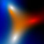
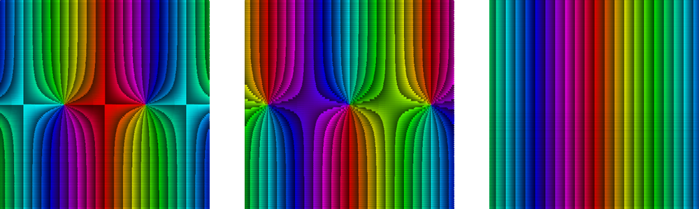
I discovered the power of this dynamic color trace method on March 8, 2009. But it wasn't until a few days later that I had the chance to apply it to real research. During the Intergeo/GeoGebra Seminar held at the International Center for Mathematical Meetings, several colleagues and I gathered in Castro Urdiales (Cantabria).
During dinner on March 27, Tomás Recio proposed the investigation of an unknown geometric locus: given a triangle with fixed vertices A and B, find all possible positions of the third vertex C such that the lengths of the bisectors* (internal or external) from A and B are equal. By applying the method, we were able to observe that very night the appearance of a teardrop-shaped figure corresponding to the locus where an internal bisector "a" has the same length as the external bisector "b".
The discovered locus is part of an algebraic curve of degree 10. (Algebraically, it is not possible to distinguish between internal and external bisectors without using inequalities, which is why the resulting polynomial includes more cases than just the one analyzed by the scanner.)
The expression used for the RGB color channels is e-|c|, where c varies per channel. This allows us not only to display the sought geometric locus (in white), but also to differentiate the inequalities b < a (reddish tones) and a < b (bluish tones). Thus, for the red channel, c = (a - b) b/a. For the green channel, c = a - b. For the blue channel, c = (a - b) a/b.
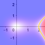
Let's look at a simple example. Given a quadrilateral with area 30, we want to add a new vertex so that when inserted between the other four (maintaining their order) the resulting pentagon has an area of 40. Where should we place this new vertex? We can try grid intersections, but this will only lead to finding one valid point.
By scanning the screen, we observe that any point along a quadrilateral with sides parallel to the original one satisfies the condition. Now we can ask our students: Why is that? And how can we construct this new quadrilateral?
An advantage of using heat maps is that students cannot "cheat" by searching for the construction in the file, since the quadrilateral they are visualizing is not constructed, nor is there any clue to construct it.
This method allows us to explore all kinds of situations, from very simple to quite sophisticated. In this case, we start with three fixed points and want to visualize the locus of points whose distance to the farthest of the three equals the sum of the distances to the other two points. The result corresponds to the zeroes of a degree-4 algebraic curve.
Both this example and the previous two show loci that cannot be obtained with other geometric tools, not even with the Locus command.
If we assign a natural number to each pixel, we can visualize the distribution of various sets of natural numbers. In this example, I've ordered the pixels following the Western reading order, from left to right and top to bottom, so that number 1 corresponds to the top-left corner pixel.
Thus, in the first quarter of a million natural numbers, we see the difference in distribution between successive powers of 2 (17 numbers), the Fibonacci numbers (26), the number of sides of constructible polygons (166), square numbers (500), and prime numbers (22044). The small number of the first three cases reminds us that, in essence, all three depend on an exponential. In the latter case, the resulting image can serve as decoration for wrapping paper 🙂.
The Elements, Book I, Proposition
47: Pythagoras' theorem
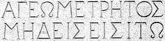
According to legend, the entrance to Plato's Academy bore the inscription: “Let no one ignorant of Geometry enter” (ΑΓΕΩΜΕΤΡΗΤΟΣ ΜΗΔΕΙΣ ΕΙΣΙΤΩ). We can see a replica of this phrase on the facade of the building we are in.
On the same facade, to the left of the inscription, is the well-known "windmill" figure representing the Pythagorean Theorem, along with a proof based on the proportionality of the sides of similar triangles (first theorem of Thales) or in the altitude theorem. Color maps can serve as an introduction to theoretical results such as this one. We start with a triangle with base BΓ and ask where to place the third vertex A so that the sum of the areas of the blue squares equals the area of the red square.
Once the map is displayed, further questions arise: why does a circle appear? What is its diameter? What is the angle subtended by that diameter from any point on the circle? This map visually represents both the Pythagorean theorem and its converse: the relation between the squares holds if and only if the triangle is right-angled, which occurs if and only if (by the second theorem of Thales and its converse) the third vertex lies on that circle.
Note: In this case, the information provided by the map is similar to that provided by the LocusEquation and Prove commands. If a, b, and c are the sides opposite vertices A, B, and Γ respectively, then LocusEquation(a² ≟ b² + c², A) returns the circle, and if A lies on the circle, Prove(a² ≟ b² + c²) returns “true.”
Sometimes we are only interested in the location of a single point. Here, the background is an aerial view of downtown Coimbra. We've overlaid a contracted and distorted version of the image. According to Banach's fixed point theorem, wherever we place the second image (as long as it stays within the first), there is exactly one point that remains fixed, where both images coincide.
However, the drawback of existence theorems like this one is that their proofs give no clue about where that fixed point actually is (only one method of successive approximations appears). Our scanner clarifies this for us by simply subjecting the scanner points to the same transformation. Thus, we find that, in this case, the fixed point is located (of course 🙂) on the statue of Dom Dinis.
Note: We use squares with trace instead of points so the trace doesn't obscure the background image.
The relationship we want to visualize may be angular rather than based on distances. This construction shows the geometric locus of all points from which two given segments are seen under the same angle. The scanner provides a simple way to reveal this complex and discontinuous locus.
It also allows you to easily propose specific problems with added "what if..." conditions. What happens if the segments are parallel? Or perpendicular? Or if all four endpoints lie at the corners of a square?...
This construction logically extends the previous one. Given triangle ABC, we apply the scanner using, in each color channel, the condition that a pair of triangle sides is viewed under the same angle. The three resulting loci, each in a different color, intersect only at the point from which all three sides are seen under the same angle (first isogonic center, X(13)). If all interior angles of the triangle are less than 120°, this point lies inside the triangle and coincides with the Fermat point.
In this example, we have an arbitrary distribution of three positive charges (blue points) and three negative charges (red points). If we introduce a new charge, where will it be in equilibrium? That is, in which positions is the vector sum of the six attractive and repulsive forces acting on the new charge zero?
The scanner shows the equilibrium positions in white. But it also tells us that larger white areas are better options, since they indicate more points where the whole doesn't become too unbalanced; they are more "stable" areas.
Note: The resulting image corresponds to the introduction of a negative charge. If the charge were positive, the image would be the same, except that the blue areas would become red and vice versa. The white areas of equilibrium, therefore, remain unchanged.
Unlike traditional curve plotting methods used by GeoGebra, the scanner does not rely on any algorithm, so there is no risk of “exceptions.” Some points of certain curves may not appear with standard plotting methods, but the scanner can make them visible again.
In the first example, the origin does not appear on the curve y³ - x³ + 4y² + 2x² = 0 in its usual graph. In the second, an entire branch of the curve x⁶ + 3x⁴y - 4y³ = 0 remains invisible. In the third, the entire curve x⁶ - 2x³y + y² = 0 is hidden. In these cases, the curve vanishes at the hidden points without changing sign. This “confuses” the implicit curve plotting algorithm used in GeoGebra and similar symbolic tools.
Note: Algebraically, the first polynomial factors as (-x + 2) x² when y = 0. The second polynomial factors as (x² - y) (x² + 2y)². The third factors as (x³ - y)².
Let's look at another geometric example. Scanners in which each point is part of a geometric construction tend to be slower than those comparing algebraic expressions, because each row in the Spreadsheet must reproduce the geometric construction.
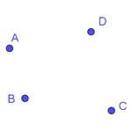
This example shows how we can visualize relationships such as the concurrence of several lines (or similar ideas, like collinearity). In particular, we are interested in identifying when four Euler lines intersect at the same point.
To do this, we start with a fixed triangle ABC and add a free fourth point D. We construct the Euler lines of triangles ABD, ACD, and BCD, and their intersections with the Euler line of ABC. The lines are concurrent when the distance between those intersection points is zero. We know that one of the points we are looking for is the incenter, since the Euler lines of the four triangles intersect at the Schiffler point. But where are the other points, if there are any?
All this information points to the circumcircle of triangle ABC and the Neuberg cubic as the geometric locus to which the fourth vertex D must belong in order for the Euler lines of quadrilateral ABCD to be concurrent. We may therefore conclude that for the condition to be met, ABCD must either be cyclic or have one vertex on the Neuberg cubic determined by the triangle formed by the other three.
Often, the locus visualized by the scanner is difficult to express algebraically. But even when an algebraic expression is the goal, the scanner's visualization greatly aids the process. The shape of the curve or segments shown makes it easier to understand the nature of the locus and to identify notable or singular points.
In this example, the scanner reveals the bisector between two curves, that is, the set of points in the plane equidistant from both curves (Adamou, 2013). In this case, formed by two elliptical arcs. The result allows us to calculate two ellipse arcs that are very close to the desired location, which may be sufficient for numerous applications (architecture, robotics, etc.).
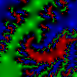
In this example, we use HSL channels (see Appendix II) to vary the color in the bifurcation diagram of the logistic equation xn+1 = r xn (1 - xn) as the coefficient r increases from 2.9 to 4 (with x0 between 0 and 1, e.g., 0.4). The study of this equation was one of the triggers for the birth of Chaos Theory.
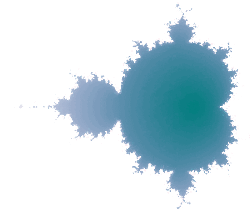
Since GeoGebra allows image import/export, we can use the graphics generated as a background for further exploration.
We can export the graphics view at different iteration levels and playing them sequentially. This allows us to observe how the fractal gradually forms.
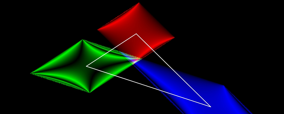
We can also see how power series, for each complex number, form polygons, spirals, and other geometric shapes.
The Mandelbrot set isn't the only fractal we can scan. Any fractal generated by successive iterations at each point (viewed as a complex number) will work, such as Julia sets. For example, we can generate a generalized Newton fractal. (See its creation in Appendix II.)
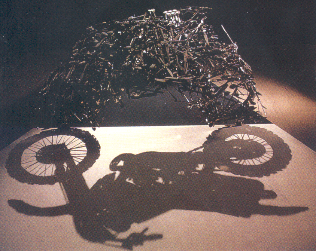
Projection of a jumble of forks, knives,
and spoons. Lunch With a Helmet On (Almuerzo con casco),
Shigeo Fukuda (1987).
Euler's formula expresses the fundamental relationship between trigonometric functions and the complex exponential. Richard Feynman called this the most remarkable formula in mathematics.
exi = cos(x) + i sen(x)
A consequence of Euler's formula, for x = 𝜋, is the famous and beautiful Euler's identity.
We can also represent the modulus of a complex function as a surface and the phase as color. This technique is known as "domain coloring" (Breda, Trocado & Santos, 2013). To enhance color transitions, we replace RGB channels with HSL. We can also add contour lines.
The idea is to assign a color pattern to a rectangle in the complex plane (visible by selecting the XZ view of f(z) = z) and observe how this pattern transforms (rotation, reflection, etc.) when we apply another complex function, such as the one in the previous section.
In the case of the function f(z) = ezi,
we can observe that the phase depends only on the real part of z.
From left to right, the images of the
colored domains of cos(z), i sin(z) and ezi.
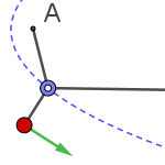
Time Trace
Just as we could create a list of positions, the TakeTime() command allows us to create a list that stores the elapsed real-time data. This enables the simulation of kinematic experiments without using formulas or predefined paths (Losada, 2024). Let's explore a few examples (a couple more examples, such as the Tautochrone or the Brachistochrone, can be seen in the Appendix III).
Free fall occurs too quickly to be measured accurately in Galileo's time. Using an inclined plane to slow the motion, Galileo was able to observe it with enough precision to conclude that falling speed increases uniformly with time.
In this example, the trace is threefold: a time trace allows us to measure the pendulum's period, a dynamic color trace shows the changes in velocity (with red indicating maximum speed), and a point trace draws the graph of angular displacement over time. All of this is done without using trigonometry or differential equations.
We use HSL to highlight color changes. The time recording confirms that, generally, the simple pendulum does not follow Simple Harmonic Motion (SHM). It closely approximates SHM only when the angular amplitude is small (under about 10°), although even with a 45° amplitude, the graphs are still quite similar. As the amplitude increases, the graph visibly deviates from a sinusoidal shape.
Above 130°, theoretical period approximations require extremely large numbers, which GeoGebra cannot compute with high precision. However, the animation's period continues to align well with the ideal model. For amplitudes beyond 175°, the period keeps increasing and tends to infinity as the amplitude approaches 180°.
Placing a pendulum at the end of another results in a double pendulum. While each pendulum individually follows a predictable period, their combined motion is chaotic.
We can use the polygonal path generated by the trace to estimate the distance traveled by the second pendulum. We have also used HSL channels to add a segment whose trace becomes clearer the higher the speed.
We can visualize the domino effect by linking a series of pendulums. We can also see that the speed of propagation of the movement is not proportional to gravity. Although gravity on Earth's surface is about six times greater than on the lunar surface, the speed of propagation on Earth is only about twice, or less, that on the Moon (the smaller the distance between the pieces, the smaller the difference).
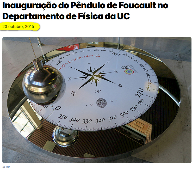
Exactly 10 years ago, the inauguration of the Foucault pendulum at the University of Coimbra (on October 25) was announced.
If we apply a time scale of 1:3600, we can simulate a full Earth rotation in just 24 seconds (but only by placing the pendulum at one of the poles). This lets us observe the Foucault pendulum's behavior at any location on Earth. In the Northern Hemisphere, the pendulum's plane of oscillation appears to rotate clockwise (retrograde); in the Southern Hemisphere, it rotates counterclockwise (direct).
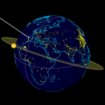
Time also leaves its trace on celestial bodies beyond Earth. Knowing the positions of the Sun, Moon, and stars allows us to determine where we are on Earth at a given moment.
We can choose the time zone (Portugal will switch from UTC+1 to UTC+0 in three days), set the date and time (or press "Now"), or select a solstice or equinox. You can also move up to three points (A, B, and C) on the spherical surface, labels will show the nearest city (either Coimbra, or another capital or city with over a million inhabitants). Clicking on the label moves the point to that location.
Ptolemy referred to Cosmography as the combination of Mathematics, Geography, and Astronomy used to represent the world. This knowledge was crucial in the early modern period, especially for Spanish and Portuguese navigators crossing the Atlantic.
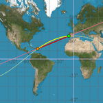
Thanks to scripting, we can link the actions of one object to another, and vice versa. In this example, a point on the globe (a 3D spherical surface) is connected to its corresponding position on the Mercator projection (2D view), and vice versa. Thus, any trace left by the first point becomes the equivalent trace of the second.
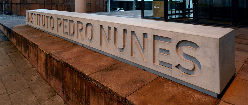
The construction shows the difference between great-circle paths (shortest routes) and loxodromes (constant bearing routes). The loxodrome was discovered by Pedro Nunes, the brilliant 16th-century Portuguese mathematician, who lived his last 34 years in Coimbra (where today a technology center and a street both bear his name). He realized this curve was not, in general, a circle but a spherical helix.
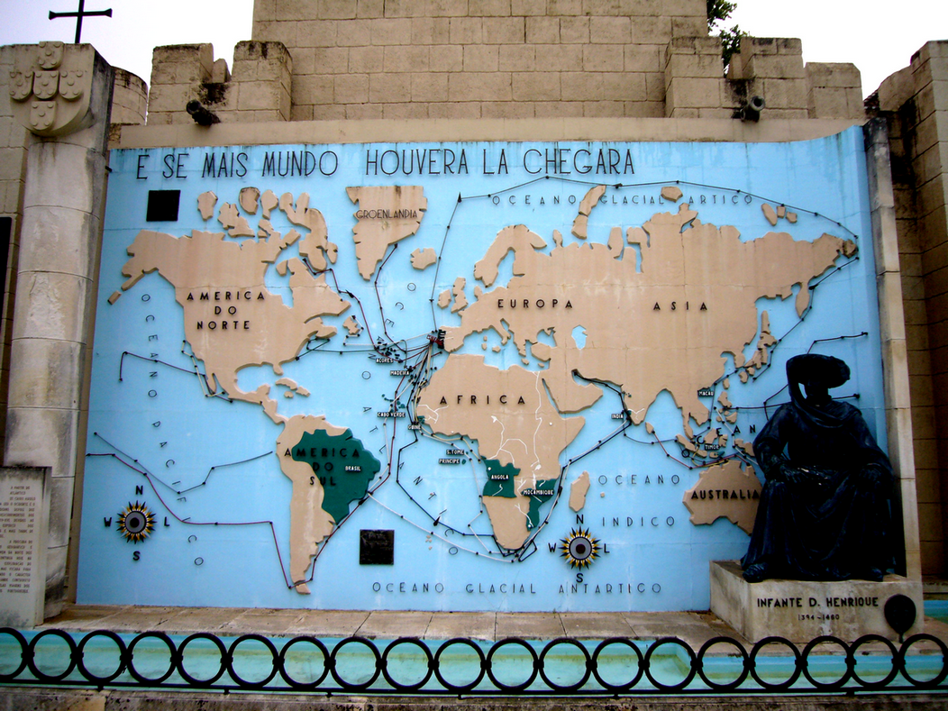
How Nunes and the famous explorers and discoverers would have loved to play with a structure like this! (The following image is from Portugal dos Pequenitos Park, here in Coimbra, one of the first miniature parks in the world; generally, a child recognizes a world map before knowing how to multiply. And, if there were more World, it would have arrived there, Luís de Camões, The Lusiads, VII-14, last verse.)
Conclusion
By observing all these traces, GeoGebra helps us explore mathematical relationships not just in the plane or in space, but also in time.
Acknowledgments
First and foremost, I would like to express my special thanks to Professor José Manuel dos Santos, and to the organizing committee of this conference, for inviting me to participate.
As usual, I also wish to thank Professor Tomás Recio for his ongoing interest, knowledge, and support over many years in various aspects of the topics discussed here.
I also thank Mariló Fernández Mira
for the photos of the arches and rose windows in the cloister of the Sé Velha
in Coimbra.
The Author
Bibliography and References
Appendix I (color trace)
A typical use of the trace is to visualize families of curves or lines. In this example, the visualization is twofold. On the left, the function y = sin(x + k) varies in k, while the point of tangency remains at x = 0. On the right, the point P on the graph of y = sin(x) moves.
The tangents at x = 0 of the functions f(x) = sin(x + k) are the lines y = cos(k) x + sin(k). The envelope of this family of lines is the equilateral hyperbola y² - x² = 1, whose asymptotes are the lines y = ±x (when k = 0 or k = 𝜋).
Thus, for point P, the trace of the lines (k = x(P)), framed by those asymptotes, forms a grid on the plane. We can also directly construct this grid using Sequence(Line((k 𝜋, 0), (k 𝜋 + 1, cos(k 𝜋))), k, -10, 10).
Appendix II (dynamic trace)
We can use Cartesian coordinates as part of the condition of each RGB channel, allowing us to divide the screen into different zones according to our interests.
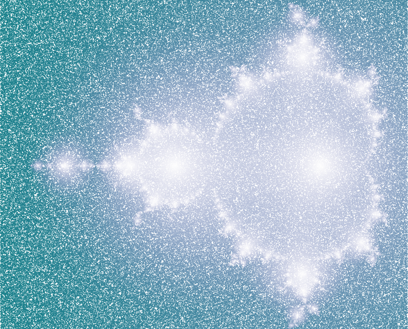
If we assign the function random() (which generates a number between 0 and 1) to each RGB channel, we get an image where each pixel's color is independent of its neighbors. This is called white noise, the familiar gray-scale pattern seen on analog TVs when they were not tuned to any channel.
Now, if we replace one of the RGB channels, for example, the green one, with an algebraic expression, the corresponding graph will stand out against the chaotic background. In this example, the green channel expression is e-|c|, where c = |P-A| |P-B| |P-C| - 25. This defines a generalized Cassini oval with three points A, B, and C.
While not usually necessary, if we want to distinguish more than three objects by color, we can replace RGB channels with HSL (Hue, Saturation, Lightness). The implementation is a bit more complex. In this example, we differentiate circles of radius r centered at points A, B, C, D, and E using these expressions:
Hue: 0.1exp(-5||P-B|-r|) + 0.2exp(-5||P-C|-r|) + 0.4exp(-5||P-D|-r|) + 0.5exp(-5||P-E|-r|) Saturation: 1 Lightness: 0.5 (exp(-5||P-A|-r|) + exp(-5||P-B|-r|) + exp(-5||P-C|-r|) + exp(-5||P-D|-r|) + exp(-5||P-E|-r|))
Replacing the
exponential function in the color channels with other expressions can
generate unexpected images. In this example, we have replaced it with a
fraction that does not always take a finite value (black points).
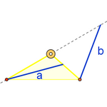
In this case, we create a triangle by drawing three tangents to a circle. We measure its area, 30 u2. Two vertices lie on the horizontal line y = -2. We want to determine where the third vertex must be placed so that both the incircle and the area of the triangle remain unchanged (we maintain a horizontal tangent, since congruent triangles are considered equivalent).
Note: Algebraically, we observe the points (x - y, x y + 1) 2/(x y - 1), where (x, y) lies on the curve 2 x² y + 2 x y² - 15 x y + 15 = 0.
We can generate a generalized Newton fractal using the iteration:
zn+1 = zn + a p(z)/p'(z)
We've chosen the complex polynomial p(z) = (z² + 9)(z - 4) and the complex number a = 1 + i. The roots (attractors) are the red, green, and blue points. Each point in the fractal is colored according to its distance (after several iterations) to the roots, and thus takes on the color of the root it converges to.
Appendix III (time trace)
These animations simulate the motion in real time, neglecting friction. They don't use formulas (neither trigonometry, nor equations, nor differential calculus), but only make the necessary variations in the vectors that guide the motion.
The load on an ideal (frictionless) zipline behaves similarly to a double pendulum. The difference is that the pulley (the first pendulum) does not trace an arc of a circle, but of a catenary. When a weight is attached, the pulley divides the cable into two different catenary arcs. If the load is heavy, these arcs can be approximated as straight lines, making the pulley's path an elliptical arc, since its path depends on the sum of the distances to endpoints A and B. As the ellipse is simpler than a catenary, we use it in this model.
Using the “anima” slider script, we record the maximum velocity reached. This shows that the load (red point) can move faster than the pulley (blue point). In real setups, the load is typically very close to the pulley, minimizing swinging, especially with friction.
The cycloid is the only curve with the property of being a tautochrone, meaning the time it takes for a mass to slide without friction in uniform gravity to its lowest point is independent of its starting point. Huygens discovered that this time is 𝜋/2 times the free fall time from the height of the diameter of the circle that generates the cycloid. That is, the oscillation period of the three points is always the same.
The cycloid is the fastest descent curve from H to P. We've added the circle passing through H, S, and P, because Galileo believed the brachistochrone should be that circle (green line), but he was mistaken (though not by much), as you can see in the construction. The green point follows a pendulum-like motion, with a period slightly longer than the cycloid. It's evident that the straight line is far from being the best option (though it improves as its slope increases, meaning P is closer to H).
|
|